
What you need to know
- Netflix announces that the redesign of its mobile application is being implemented in several countries.
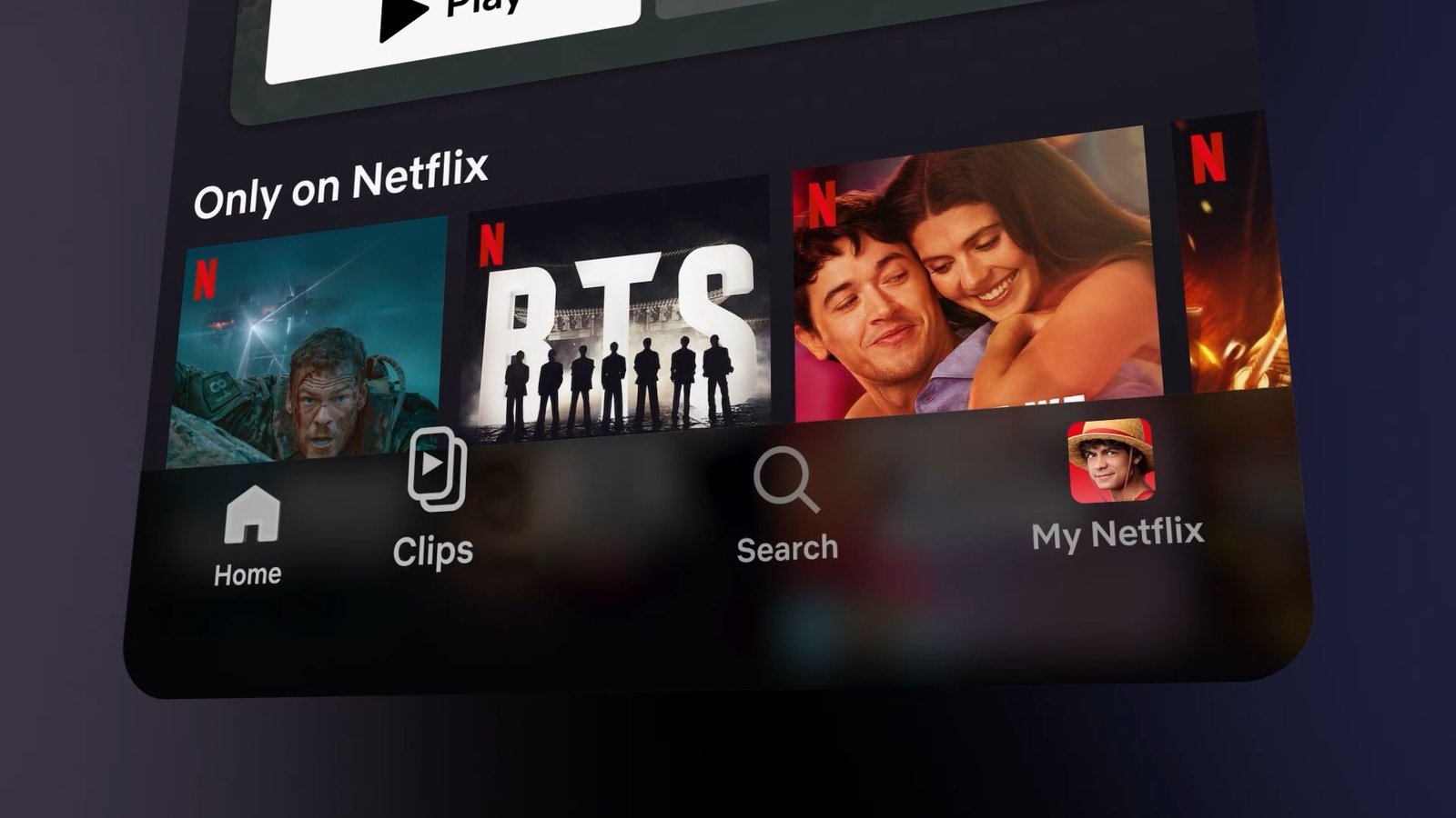
- The app now displays commonly used content, such as shows, movies, categories, and more, front and center.
- Another major highlight is the “Clips” feed, where users can scroll through a set of relevant vertical videos to find new shows or movies to watch.
Netflix is expanding its resources to redesign its mobile experience and users can expect that to roll out now.
netflix announced this week that its major mobile app overhaul is rolling out in the US, UK, Canada, Australia, India, Malaysia, Pakistan, Philippines and South Africa. It’s no surprise that many people are constantly in front of their phones throughout the day and many also watch their shows or movies there. In this redesign, Netflix says it’s putting “what matters to you front and center, with streamlined navigation and a visual, top-down discovery experience that feels right at home on your phone.”
Users will notice a top navigation bar packed with shows, movies, podcasts, what’s on and off, and categories. Below there will be highlighted content before users scroll down to Continue Watching, Top Picks, and more.
Article continues below.

A significant portion of the work for this redesign went into Netflix’s new “Clips” feed. If you are familiar with Reels on Instagram or YouTube Shorts, you will feel quite comfortable. Netflix says this vertical video stream was “designed for the way you actually use your phone: fast, visual, and easy to tap into something that catches your attention.”
The Clips feed is intended to be personalized, as viewers can find something new to watch that might interest them “without having to scroll endlessly.” If you found a show or movie you like, users will notice the “Add to my list” button. Plus, sharing shows or movies you like with other people is half the fun. Users can share a clip from their feed via text or social media.
Plus, in addition to what’s relevant to you, users can “Browse” clips. Through this, users will tap into the vast expanse that is Netflix’s entertainment catalog to find content they never knew they would like.

The idea of a vertical feed first emerged earlier this year, during Netflix Q1 Earnings Call. While the company posted 16% year-over-year (YoY) revenue growth, an executive discussed its plans for 2026. Netflix said it was planning to revamp its mobile experience and drive greater engagement through this vertical video streaming. It was claimed that this feed would be involved in a new “discovery feed”, which we know as “Clips”.
Furthermore, that Mentioned Netflix TV Redesign It was just what the entertainment doctor ordered. The company introduced greater flexibility and responsiveness to TVs, showing tags for shows and faster access to My List and Search.
Android Central’s opinion
I don’t think Clips is a bad feature. Sure, it looks like all the other vertical things we’ve seen recently (Disney, included), but it could find its place. I think for people who open the app and just want to see what’s new, this could be useful.


