
Google is developing a major icon redesign for its Workspace apps, including GmailGoogle Drive, Google Calendar, Google meetingSheets and Slides. 9to5Google shared the first versions of the new icons, although they have not yet started rolling out to users.
This redesign follows a similar gradient update that Google applied to Maps and Photos earlier this year.
What’s changing in the new workspace icons?
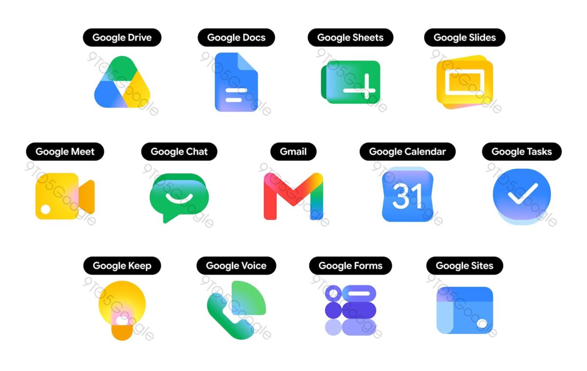
(Credit: 9to5 Mac)
The new icons feature a gradient finish that aligns with Google’s updated design language, moving away from the previous use of the four Google brand colors seen on most Workspace app icons. The Google Drive icon now skips red and focuses on green, yellow, and blue with a gradient effect.
Google Calendar is switching to a more blue-centric design that resembles previous versions of the app. Gmail maintains its envelope shape with the M layout but replaces flat colors with gradients. Google Meet is adopting a predominantly yellow color scheme while keeping the original video camera icon.
When will the new workspace icons be implemented?
Google hasn’t announced a release date for the updated icons or specified which platforms will get them first. The redesign is currently being prepared, but has not yet started rolling out to any users.
More details are expected as icons begin to appear in test versions.


